CSS3 animation 属性图文解析
发表时间:2018-08-21 11:26 责任编辑:莫都晨晓 浏览:
次
DIV代码
<div id="con">
<img src="images/brand4.png">
<div>
css代码
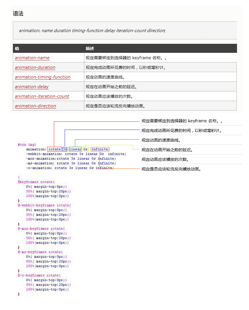
#con img{
animation: rotate 3s linear 0s infinite;
-webkit-animation: rotate 3s linear 0s infinite;
-moz-animation:rotate 3s linear 0s infinite;
-ms-animation: rotate 3s linear 0s infinite;
-o-animation: rotate 3s linear 0s infinite;
}
@keyframes rotate{
0%{ margin-top:0px;}
50%{ margin-top:20px;}
100%{margin-top:0px;}
}
@-webkit-keyframes rotate{
0%{ margin-top:0px;}
50%{ margin-top:20px;}
100%{margin-top:0px;}
}
@-moz-keyframes rotate{
0%{ margin-top:0px;}
50%{ margin-top:20px;}
100%{margin-top:0px;}
}
@-ms-keyframes rotate{
0%{ margin-top:0px;}
50%{ margin-top:20px;}
100%{margin-top:0px;}
}
@-o-keyframes rotate{
0%{ margin-top:0px;}
50%{ margin-top:20px;}
100%{margin-top:0px;}
}
图文解析
<div id="con">
<img src="images/brand4.png">
<div>
css代码
#con img{
animation: rotate 3s linear 0s infinite;
-webkit-animation: rotate 3s linear 0s infinite;
-moz-animation:rotate 3s linear 0s infinite;
-ms-animation: rotate 3s linear 0s infinite;
-o-animation: rotate 3s linear 0s infinite;
}
@keyframes rotate{
0%{ margin-top:0px;}
50%{ margin-top:20px;}
100%{margin-top:0px;}
}
@-webkit-keyframes rotate{
0%{ margin-top:0px;}
50%{ margin-top:20px;}
100%{margin-top:0px;}
}
@-moz-keyframes rotate{
0%{ margin-top:0px;}
50%{ margin-top:20px;}
100%{margin-top:0px;}
}
@-ms-keyframes rotate{
0%{ margin-top:0px;}
50%{ margin-top:20px;}
100%{margin-top:0px;}
}
@-o-keyframes rotate{
0%{ margin-top:0px;}
50%{ margin-top:20px;}
100%{margin-top:0px;}
}
图文解析
语法
animation: name duration timing-function delay iteration-count direction;
| 值 | 描述 |
|---|---|
| animation-name | 规定需要绑定到选择器的 keyframe 名称。。 |
| animation-duration | 规定完成动画所花费的时间,以秒或毫秒计。 |
| animation-timing-function | 规定动画的速度曲线。 |
| animation-delay | 规定在动画开始之前的延迟。 |
| animation-iteration-count | 规定动画应该播放的次数。 |
| animation-direction | 规定是否应该轮流反向播放动画。 |
CSS3 @keyframes 规则
语法
@keyframes animationname {keyframes-selector {css-styles;}}
| 值 | 说明 |
|---|---|
| animationname | 必需的。定义animation的名称。 |
| keyframes-selector |
必需的。动画持续时间的百分比。
合法值:
0-100% 注意: 您可以用一个动画keyframes-selectors。 |
| css-styles | 必需的。一个或多个合法的CSS样式属性 |
技术支持


相关阅读
- 1将文本垂直居中08-06
- 2dede:arclist按照自定义字段的条件调05-07
- 3js把英文逗号换成中文逗号04-01
- 4dede编辑器添加MP4视频上传功能01-08
- 5ssl证书12-22
- 6dede简单把分页页码改成英文10-30
- 7IIS7 环境中http重定向到https的设置04-01
- 8dedecms安全漏洞之/include/common.inc06-04
- 9织梦DEDE include/dedesql.class.php变量覆06-04
- 10dede自定义表单发送邮件提醒(非05-17
- 11dede列表页异步加载,点击加载更04-30
- 12正则表达式应用——实例应用04-25
- 13dede自定义表单防止恶意提交,增04-11
- 14goole地图API代码生成制作01-24
- 15CSS:text-fill-color 给文字增加图片蒙01-22


